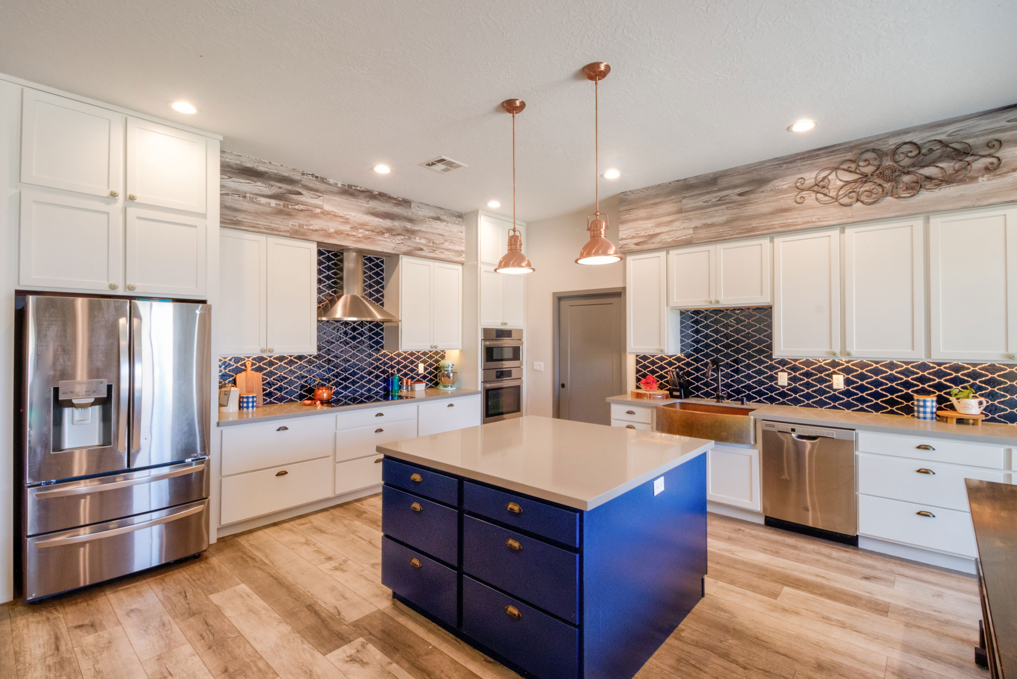
One such space is above the kitchen cabinets. There is typically a lot of decor real estate up there that can have a tendency to look overcrowded or sparse. In my own home I chose to utilize the concept of a soffit. While you won't see these in homes much these days, a soffit is nothing more than a framed extension from the ceiling down to the cabinets. I chose to cover my soffit in a vinyl plank material to give it an updated and rustic feel. Not only does this eliminate the typical dust trap that typically is present when leaving the tops of the cabinets exposed, it also reduces the amount of decor pieces needed to fill the empty space and allows the decor items I hang on the soffit to be fully visible instead of being partially obscured by part of the cabinetry.

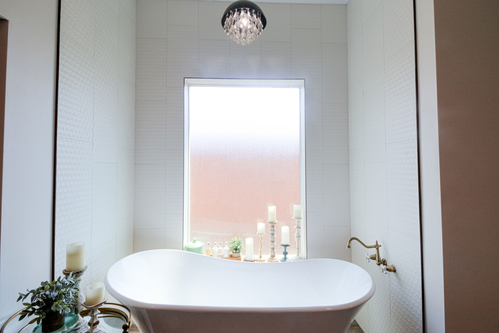
Bathrooms can easily become a source of design consternation due to the typically small spaces and at times odd angles. One of my favorite design tricks is to use a patterned tile from floor to ceiling in lieu of wallpaper. It provides visual interest without taking up space, is easy to clean and can handle the moisture levels a bathroom dishes out.
One of the most common dilemmas I’ve noticed in many homes in the area has to do with lighting. The tricky thing, especially during the summer months, is to allow as much natural light in as you want, when you want it, while at the same time keeping the heat out and the cool air in as much as possible.
